Wednesday 31 July 2013

Opposites week - Jane

Hi, 
Jane's turn today and she chose to go with LIGHT vs DARK. 
This makes quite a dramatic change to your card. Look below, the same stamp and designs are used yet the cards look so different. I would say the dark one would be more suitable for a teen when the lighter one could be used for a younger kiddo. 
Let us know what you think in a comment below.


Opposites week and I decided on 'light and dark'

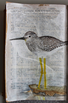
 Just by using different colours changes the look of your projects.  First is 'light'

 Now using darker colours

 The images were coloured with Copics.  I just love these stamps

Stamps - Lindsay Mason - Doo Lally Pip - Moochin and I've Had Enough
Copic markers - E000,00,11, Y21, E31,33,35, B91,93,95,97, W3,5,7,8, C1,2,3,5, R56,59 RV93, BG11,13,72, T0,1,2
Kaisercraft paper - Bonjour Collection - Notre Dame

See you tomorrow

Tuesday 30 July 2013

Opposites week - Neil

Hi, 
Here's Neil's version on an AJ page today. Neil chose COLOUR vs BLACK and WHITE. Same stamp and design but the difference the colour makes is rather striking, don't you think? 
Love the little hiding place for the journaling.


Each page was done the same way with Tissue Tape, PaperArtsy and Kaisercraft stamps. The stamping on the B and W page was done with white Distress Paint and Black Archival ink on the colour page.  

The colour on this page was done with Distress paints too. I used Distress Markers to colour the character. 
To add a bit of interest to the page I used a mask to add some cogs to the edges of the page with Black Soot Distress Ink.

And, just because I wanted to add an element of surprise; each page has some hiding places for journaling. 

Neil used:
Distress Paints - Mustard Seed. Picket Fence, Peeled Paint, Fired Brick.
Andy Skinner Mask - Incognito
Distress Ink - Black Soot
Distress Markers - Peeled Paint, Marigold, Fired Brick

See you tomorrow


Monday 29 July 2013

Opposites week - Gay

Hi everyone 

Once again we are going to approach something that we have never done on this blog: Opposites. 
Each team member has chosen two "opposites" and interpreted it with gorgeous samples as they always do.
Needless to say that you are going to see a lot of different artwork this week. 

Starting with our guest designer Gay who chose to work with "Shiny and Matte" and made those three beautiful frames for you. 

Please take the time to let her know what you think.


 I love box frames and here my frames are shiny on the outside and matte on the inside with gilded silhouettes.

I started with tacky glue and drew shapes on the frames, leaving that to dry overnight.  

 Painting over the whole frames with Acrylic paints in many colours to give depth.

 After the paint had dried I added Treasure Gold in 3 colours with a paintbrush, I polished it with a clean rag ( old sock ) when it was dry and it's amazingly metallic and shiny. All the way through the whole process I was adjusting the colours and trying different tones to see which I liked, finally I settled on a slightly blue bias. The inside background was painted with Phthalo Green-blue and black a truly dark but interesting (I hope ) background for the die cuts.

 The silhouettes are die cut from black card and gilded, they were mounted on foam pads to add dimension.


Gay used
Treasure Gold: Onyxite, White Fire and Aquamarine.
Tim Holtz Alterations Die, Movers and Shapers Mini Silhouettes

See you tomorrow


Sunday 28 July 2013

Letter Y winner and Wall of fame

Hi, 
Well done on all your entries for the Y.. Not an easy letter, and the Yellow twist challenged a few. 
We had quite a few Yellow (that was given lol), You, Young/Youth, Yoga.... 

So for the winner this week, I asked my little one to give me a number and she said 32!

32 is Laura and her beautiful drawings.


Congratulations!
Please get it touch so I have your email to send you the voucher

Now for the Wall of Famers... 

Danielle chose Yesterday

Annie (new to our challenge) chose Year

Dawn chose Yellow

Maggie chose Yarn


and Claire chose Yoga


Well done to all of you. 
If you would like to add a Fall of Fame or a Winner logo to your blog, please get in touch and I will send you one. 

See you tomorrow


Saturday 27 July 2013

Saturday Savers - A splash of colours - Sylvie

Hi, 
End of this beautiful splash of colours week. I hope you enjoyed it as much as we did. 
Another home decor piece for you with a stunning sample by Sylvie who had a go at toilet paper rolls again :). How wonderful would it be to have such a display in your home?

Sylvie's colour scheme was: brown-white-turquoise/teal


In white cardstock, cut three 4.5 cm strips and three 3 cm strips
On the first one, stamp the Lindsay Mason designs and emboss them with the Cosmic Shimmer embossing powders (Persian sea aurora and Arctic bay lustre)
The second one is inked with Distress ink Peacock feathers before being stamped and embossed with white embossing powder. 


The third 4.5cm strip will be brown (inked with Distress Stain Walnut Stain) and embossed with silver embossing powder.
For the remaining strips you just ink them with no embossing: one in turquoise, one in brown, the last one remains white.

Using a score board, score the strips of paper every 1 cm to make rosettes
Punch/die-cut the circles which will be inked and used as at the back of the rosette to hold it in place.

Now for the upcycling part.
Take 5 toilet paper rolls
Cut a piece of card and apply grunge paste through a stencil with a palette knife and let it dry. Colour the design with Distress ink. 
Glue this paper on each toilet paper roll 
Stamp the birds several times on white cardstock
Colour them with Promarkers and cut them out.
Tie the rolls together with a ribbon.
Glue the rosette on bamboo sticks (different length) and place them in the "mini vases"
Glue the owls on the big rosettes and punched out leaves + small punched leaves in the centre of the small rosettes


Details


Sylvie used
Distress inks: Peacock Feathers 
Distress stain: Walnut Stain 
Kaisercrafts paper Blooms: Sea Breeze, Coconut

See you tomorrow

Friday 26 July 2013

A splash of colours - Jane

Hi, 
Jane's turn and her colour scheme was Pool: orange - turquoise - white
I have to share Jane's first reaction when she saw the colour scheme I gave her:
"Orange ,blue and white..........are you having a laugh Izzy?????"

Yes I laughed.. when I read her reaction... 
I must add that I did NOT impose the colour schemes. I did say, if you don't like it, let me know, I'll change it. 
But Jane took up the challenge and came up with this really pretty bracelet and earrings. Sometimes pushing people out of their comfort zone is a good thing.

As the summer has finally got here and holidays are not far off for some, I decided on some jewellery for that hot, sunny day sitting round the pool........not in this country obviously.....
The bracelet is made using elasticated cord so really doesn't take long to do.  Arrange the beads how you like and tie off in a tight knot


The matching earrings are made using short flat end head pins and looped onto jump rings 

Materials used -
Tiny bead mix: Wedding Days, Tutti Fruity and China Blue
Fish hook Earwire: silver plate
Round jump rings 5 mm: silver 
Short Head Pins: silver 

See you tomorrow

Thursday 25 July 2013

A splash of colours - Neil

Hi, 
Here's Neil take on the Splash of Colours theme with a lovely Art Journal page. 
What I had given to Neil was: "Summer by the lake" with the colours green(s)-brown-blue 
I guess he took that quite literally :)


I began my page by painting a lake in Desert Turquoise and the ground in Mint Julep Green. The sky is Calypso blue.
Then I took the Eclectica stamps and used a combination of Burnt Sienna and Fawn paint to stamp the leaves onto the bottom of the page. I used Avocado and Mint Julep paints for the leaves on the top of the page. I used Napa Red and Marigold to stamp the flowers onto white card. I used Cut and Dry Foam to apply the paint. I must say that these stamps work really well for stamping with paint; just remember to clean them immediately!


 I cut the flowers out and stuck them down. All the details were outlined with a black marker, some detail added with Peeled Paint and Stormy Sky Distress Marker and the journalling was done in a white pen.

Materials
Inkessentials white pen

See you tomorrow


Wednesday 24 July 2013

A splash of colours - Karen

Hi, 
Karen is with us today and her colour combination is Red-Orange-Yellow. I think I had sunset on the beach in mind when I chose that one LOL. 
Karen chose to use one of Neil's fabulous book cover to make an art journal. 
Here's how she did it.... 

I have chosen to decorate one of Neil Walkers fabulous Book Covers from Tando Creative. There are three layers to each side and are very sturdy when made up. I started by painting the elements using Pebeo Cadmium Yellow Hue, Pebeo Cadmium Orange Hue and PaperArtsy London Bus.  
Tip of the day: if you are going to use a Bind It All, now is the time to make your holes as the book cover will not fit in when glued together!  

Take the outer sections (which I have done in red) and using the Tando Creative Mask - Sequin Waste - apply Imagination Crafts Sparkle Medium in Bright Red. While this is drying apply a bit of the PaperArtsy London Bus and Beach Hut paint to a scrap of white card. Taking the yellow base of your book stamp flowers from PaperArtsy JOFY 10 with Perfect Medium and emboss in Stamp and Stuff Blue. Also stamp and emboss the flower heads onto the painted card.  
Cut the heads out and attach over the stamping on the yellow base.

 Go around all the edges with Brilliance Ink in Rocket Red and then glue your pieces together. I have added a computer generated quote to the front and used a Bind It All to make the book. To make the pages I have used some of my unwanted scrapbook paper and just torn them to the right size. Now its all ready for journaling!


Karen used
Neil Walker for Tando Creative Book Cover - Ancient
Tando Creative Masks - Sequin Waste
PaperArtsy JOFY Stamp Set 10
Pebeo Studio Acrylic Paint - Cadmium Yellow Hue and Cadmium Orange Hue
PaperArtsy Fresco Finish Paint - London Bus and Beach Hut

See you tomorrow


Tuesday 23 July 2013

A splash of colours - Gay

Hi, 
Gay's colour combination is yellow, grey and white... One of my favourite colour combination at the moment I must say. 
Gay made a couple of cards which just shout out "summer" me think. 
What do you think of those? Let us know in a comment below.


For the first card, I used an IndigoBlu Heart Stamp, stamped twice to stretch the design, in yellow on white card. 
I stamped again on white card then embossed in white but stained with yellow and coloured with Copic markers.


Gay used 
IndigoBlu Stamps Poppy Heart
Distress Ink: Mustard Seed
----

For the second card, I applied Distress ink Mustard Seed with a sponge through the Butterfly Daisy mask.
I then added a touch of glitter on the flower centres.

I used
Imagination Crafts Butterfly Daisy mask
Sentiment stamp from Kaisercraft Proud.
Distress Ink: Mustard Seed
Stickles in Gold.

See you tomorrow


Monday 22 July 2013

A splash of colours - Gio

Hello, 
If there is something that puts you in the summer mood, it has to be vibrant colours. And with the neon colour trend this summer, we definitely have a lot of brightness around. Love this trend, so much fun.

So we thought about doing a colour week, and I challenged my DT to make samples with specific colour combos. I did not go "neon colour".. although very tempting... as I know it's would be fun, but it's not everyone's cup of tea. 
As I type this, I have not made my sample yet... so you never know... with the colour combo that I have to use, it IS possible to use neon colours..... we shall see. ... hmmm, we have those new neon Pebeo paints in stock....

So combo one: turquoise/teal - white - brown and Gio took the word "splash" quite literally on this one. 
LOOOOVE her samples, those cards are so much fun. I guess it's gelato time ;).


For the scrapbook page, I cut a white cardstock to size. I put a little amount of Cosmic Shimmer Misters Bilberry Crush in a syringe. I pressed on the seringe quickly the white cardstock. When dry, I added the Teal Wash in the same way. I cut some strips from some gauze and I sprayed them with the same mists. I rolled them until I get some simple flowers. To get them stay in place I used a head pin. I cut a triangle from Pebeo Cotton Pop Art canvas pad - A4, and I painted it lightly with DecoArt Traditions Artist Acrylic: Quinacridone Gold.
I decorated the fabric rolls with some tiny beads. I stamped the background using Woodware clear stamp: Alphabet background and Ranger Archival Ink pad: Jet Black .

I added a stitched border with the sewing machine. I glued the background to a piece of larger white cotton, and I stitched this one, too.
I painted a wooden hanger with Fresco Finish paint Beach Hut. I adhered the picture, the canvas triangle along with the fabric rolls to the cardstock. I glued the title made out of Tando Creative: Alphas Sheet style Block Serif, and I wrote the journaling.


-------

For the pink card: I cut white cardstock to size. I put a little amount of Cosmic Shimmer Misters Bilberry Crush on a syringe and splattered the card. I cut a triangle from Pebeo Cotton Pop Art canvas pad - A4, and I painted it lightly with DecoArt Traditions Artist Acrylic: Quinacridone Gold. I glued to the cardstock. I stamped the sentiment using CI-256 - Handy sentiments and Ranger Archival Ink pad: Jet Black .


For the blue card: I cut  white cardstock to size. I put a little amount of Cosmic Shimmer Misters Bilberry Crush on a syringe and splattered on the card. I cut a triangle from Pebeo Cotton Pop Art canvas pad - A4, and I painted it lightly with DecoArt Traditions Artist Acrylic: Quinacridone Gold. I glued to the cardstock along with three rolled flowers. 
I stamped the sentiment using CI-256 - Handy sentiments and Ranger Archival Ink pad: Jet Black .


Gio used: 
DecoArt Traditions Artist Acrylic: Quinacridone Gold 
Woodware clear stamp: Alphabet background 
CI-256 - Handy sentiments

See you tomorrow